The Psychology of Color in Branding: How to Choose a Palette That Defines You
The Psychology of Color in Branding: How to Choose a Palette That Defines You
Color is the quickest story your brand can tell. Before a headline is read or a logo is recognized, color sets mood, frames value, and primes expectation. Used well, a palette can make a young brand feel established, or a heritage brand feel current. Used poorly, it creates noise, confusion, and distrust.
This guide shows how to choose color with intention. It blends psychology, strategy, and craft so your palette feels true, looks refined, and works everywhere you show up.
What Color Signals in the First Second
People react to color before they process words. In that first second, color often communicates five things.
- Positioning. Deep neutrals and restrained accents read premium. Bright primaries read mass or playful.
- Tone of voice. Cool palettes suggest calm and authority. Warm palettes suggest approachability and energy.
- Category fit. Blue and navy are common in finance and tech. Earth greens and soft neutrals are common in wellness.
- Distinctiveness. A single signature hue builds memory. Think Tiffany Blue or Hermès Orange.
- Trust. Consistent color breeds familiarity. Inconsistent color erodes it.
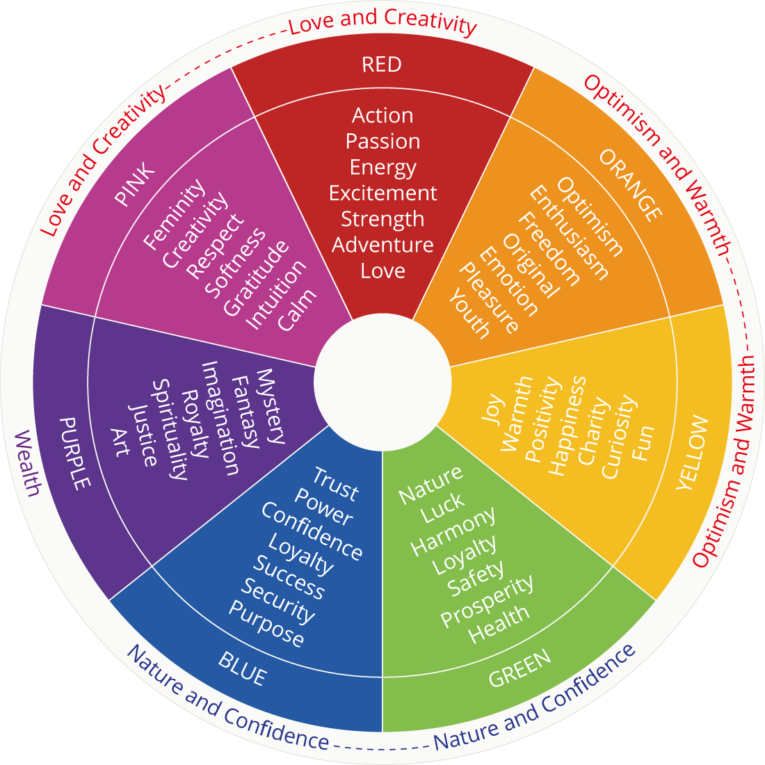
A Quick Map of Color Psychology
Treat these as starting points, not rules. Saturation, temperature, and contrast change the meaning.
- Black and near-black. Power, restraint, timelessness. Signal confidence when paired with quiet typography.
- White and bone. Clarity, space, purity. Useful as a canvas that elevates photography and product.
- Gold and brass. Achievement and craft. Feels premium in small, precise amounts.
- Deep blues. Trust, credibility, focus. Push toward midnight for luxury, toward cyan for tech.
- Greens. Balance, nature, wellness. Olive feels luxe. Lime feels mass.
- Reds. Urgency and desire. Works as a sparing accent for calls to action.
- Purples. Imagination and rarity. Desaturate toward aubergine for sophistication.
- Neutrals. Taupe, stone, charcoal. The glue of a modern palette. They carry taste without shouting.
How to Choose a Palette That Fits
1) Define the feeling first
Complete this sentence in plain language:
When someone lands on our brand for the first time, we want them to feel ______.
Choose three words. For a premium brand it might be calm, assured, and rare. Your palette must carry those words without explanation.
2) Map the competitive field
Lay ten competitor logos on a slide. Sample their primary and secondary colors. Notice the herd. Your palette should live near the category to feel relevant but far enough to be remembered.
3) Build a simple system
Strong palettes are small and disciplined.
- Primary base. One dark or mid neutral that anchors layouts.
- Primary brand hue. One signature color that can own recognition.
- Secondary support. One or two supporting hues for depth and seasonal range.
- Functional accents. One positive state, one warning state, one link or CTA color.
Aim for two to three brand colors plus neutrals. Use accent hues like seasoning, not the meal.
4) Tune saturation and temperature
Luxury rarely lives at full saturation. Pull your signature hue down in saturation and slightly toward cool or warm depending on the emotion you want. A cooled indigo feels composed. A warmed burgundy feels intimate.
5) Test contrast and accessibility
A premium look still has to be readable. Check heading, body, and button contrast against WCAG standards. Dark text on pale stone can feel refined and still pass. Nothing kills trust faster than illegible buttons.
6) Prove it in the wild
Evaluate your palette on real surfaces, not just swatches.
- Homepage hero with photography
- Product detail page and add to cart
- Paid social and story placements
- Email header, body, and CTA
- Deck slide with charts and data
If it fails on any core surface, adjust early.
Luxury Use Cases That Work
- Monochrome plus metal. Charcoal and bone with a metallic gold accent. Reads crafted and expensive.
- Midnight plus mineral. Midnight blue with a desaturated jade or malachite accent. Calm, intelligent, and modern.
- Walnut neutrals. Stone, taupe, and warm gray with black typography. Quiet confidence for hospitality and interiors.
- Editorial indigo. Deep indigo paired with bone and subtle brass. Strong identity with minimal ink on the page.
Cultural and Context Nuance
Color meanings shift across markets. Red can mean love or warning, luck or urgency. White can signal purity or mourning. If you sell globally, validate your palette with local eyes. Do not assume a Western reading of color will hold everywhere.
Naming, Governance, and Scale
A palette survives contact with teams only when it is easy to use.
- Name your colors clearly. Indigo 700, Bone 50, Brass 300. Avoid cute names that confuse.
- Define roles. Which colors are for backgrounds, text, dividers, charts, and buttons.
- Supply tokens. Provide HEX, RGB, CMYK, and Pantone. Add design tokens for developers.
- Document usage. Good, better, best examples. Wrong usage examples to prevent drift.
- Version control. If you evolve a hue, update tokens and announce the change.
Common Mistakes to Avoid
- Too many heroes. Four loud colors fight each other. Choose one hero and let the rest support.
- Over-bright accents. Neon cheapens quickly. If you need punch, brighten value, not saturation.
- Ignoring photography. Color and imagery must share a mood. Warm photos with cold UI feels split.
- No contrast plan. Beautiful but unreadable is not premium. It is broken.
- Seasonal chaos. Seasonal tints are fine. Changing the core hue each quarter erases memory.
A Simple 30-Minute Palette Exercise
- Write your three feeling words.
- Pull five reference images that match those feelings. Interiors, materials, art.
- Sample five to eight colors from those images.
- Select one neutral base, one signature hue, one support hue.
- Create two button styles and a hero section.
- Check contrast. Adjust saturation and lightness until both beautiful and legible.
- Save as tokens. Share a one page spec.
How Color Signals Luxury
Color is one of the strongest codes in luxury. A single, protected hue can carry decades of meaning.
- Tiffany & Co. Tiffany Blue signals romance and rarity. One shade, used sparingly, became the brand itself.
- Hermès. Hermès Orange feels artisanal and confident. The box is as recognizable as the product.
- Cartier. Cartier Red reads as ceremonial and precise. It frames gold and diamond tones without shouting.
- Chanel. Black and white create timeless contrast. The palette lets materials and silhouette do the talking.
- Burberry. Knight Blue refreshes heritage without losing weight. A modern tint that still feels British.
Takeaway: choose one signature hue, build calm neutrals around it, and use it with restraint. Consistency turns color into equity.
When to Evolve What You Have
If your palette is inconsistent across channels, feels dated next to your peers, or fails accessibility checks, you do not need a full rebrand. Often a five degree shift solves it. Darken the base, cool the accent, or introduce a smarter neutral. Keep recognition. Improve execution.
The Deus Lens
We treat color as craft and as system. The palette must carry feeling in a single glance and behave well across every surface. When it does, you do not need to shout. Your brand will be recognized by tone, by calm, and by taste.
Choose color that tells the truth about your brand. Then protect it with discipline. That is how a palette becomes an identity, not just a set of swatches.

